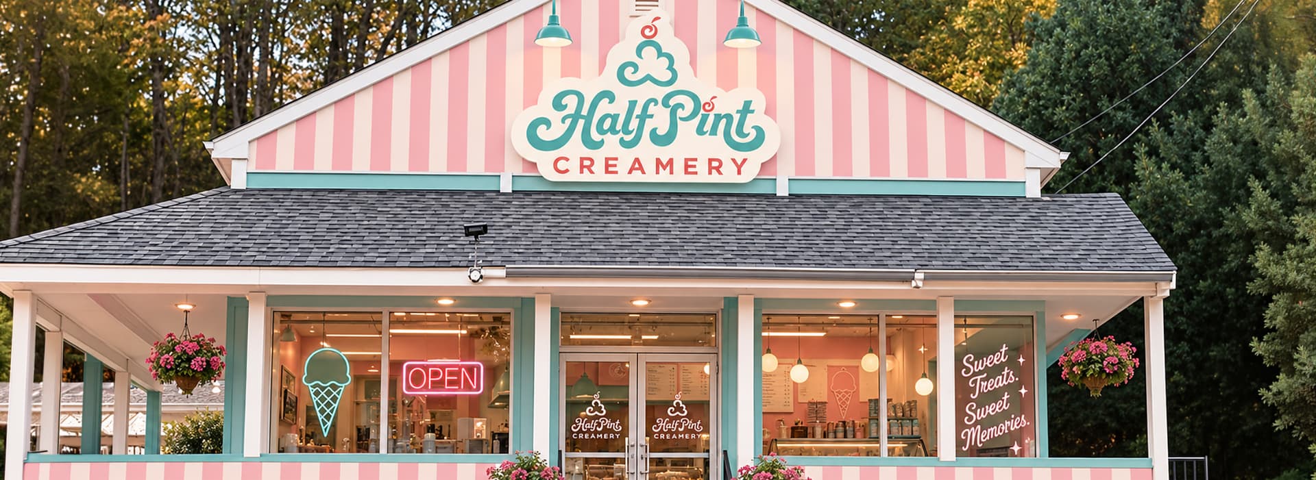
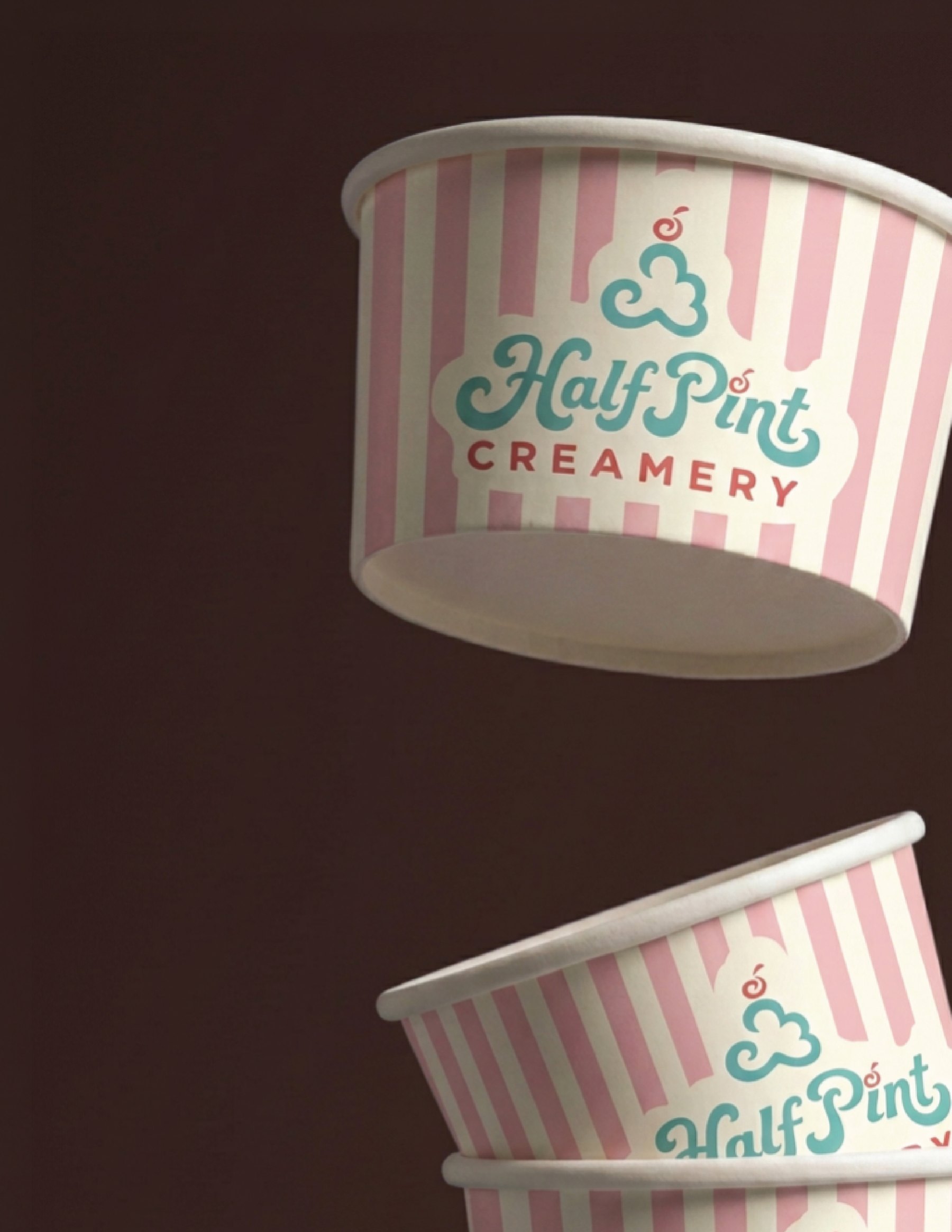
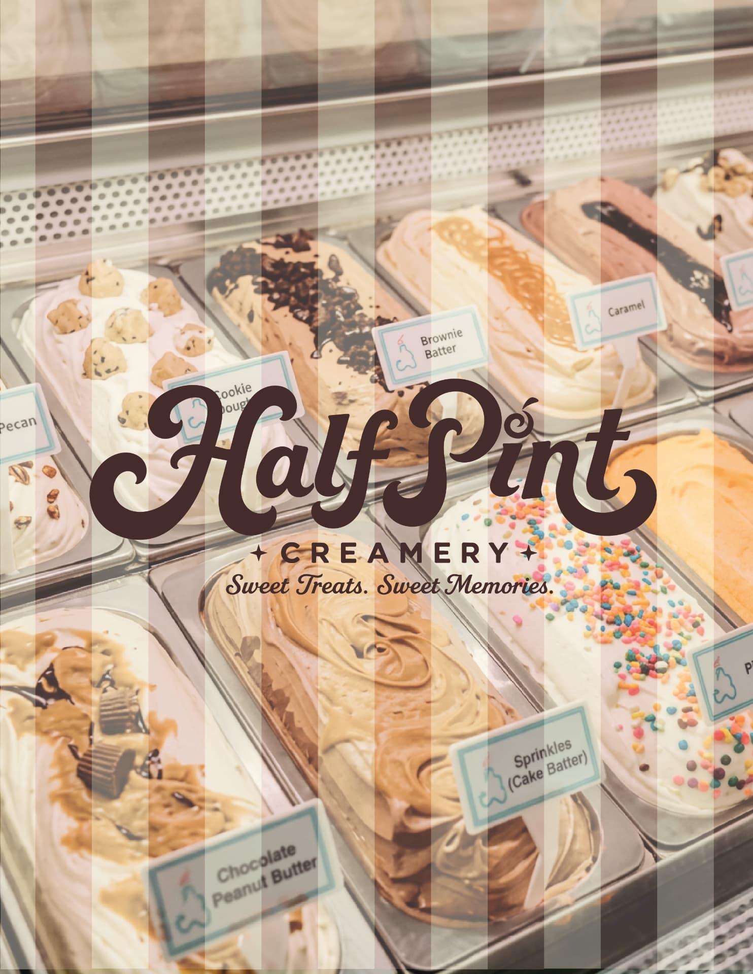
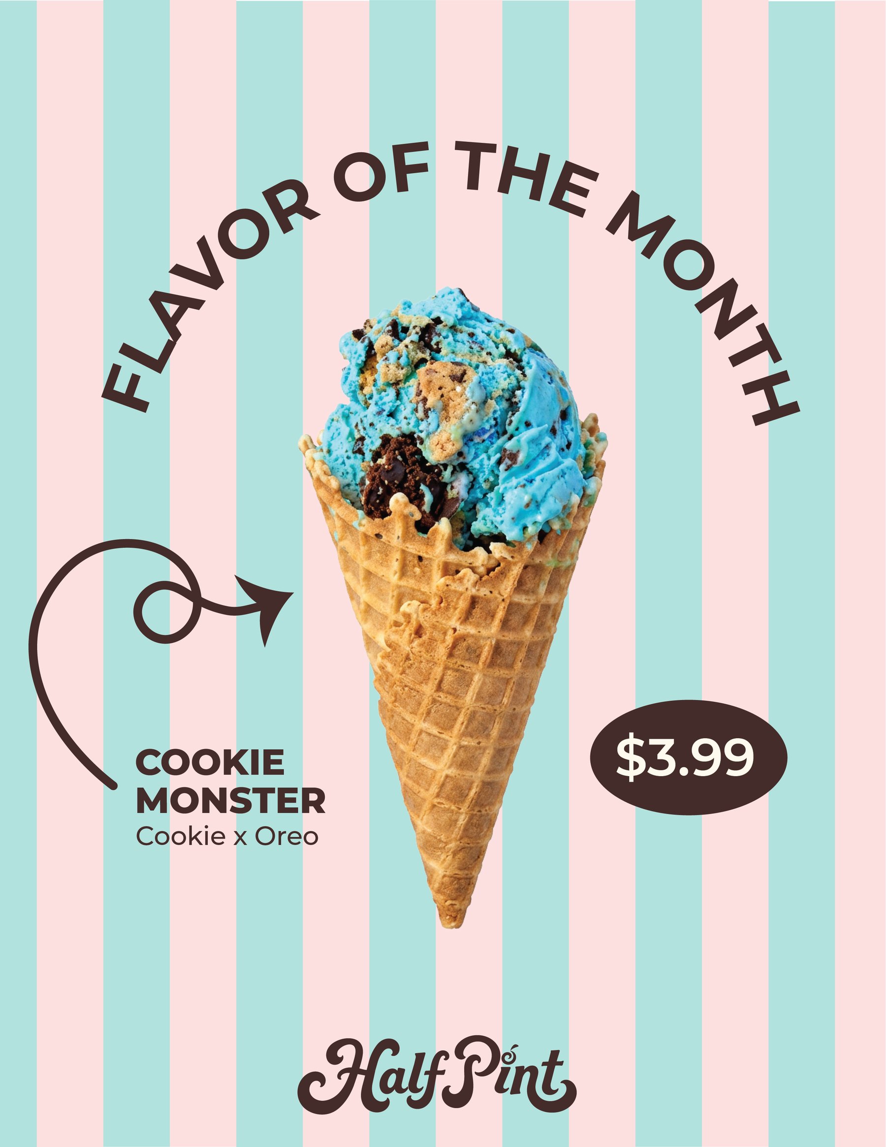
A concept identity refresh that balances Half Pint Creamery’s established recognition with a cohesive visual direction. Expressive lettering, a pink, mint, and cream palette, and playful brand elements extend across packaging, signage, and social media. A separate paid commission brought the Super Secret Scoop Society to life through monthly ticket designs.
The rebrand was created as a concept. The Super Secret Scoop Society ticket campaign was paid client work.
The challenge
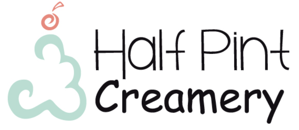
Refresh Half Pint Creamery’s visual identity without losing the 12 years of recognition built around its existing logo. The concept needed to retain that familiarity while establishing a consistent brand presence across physical and digital touchpoints.
The solution
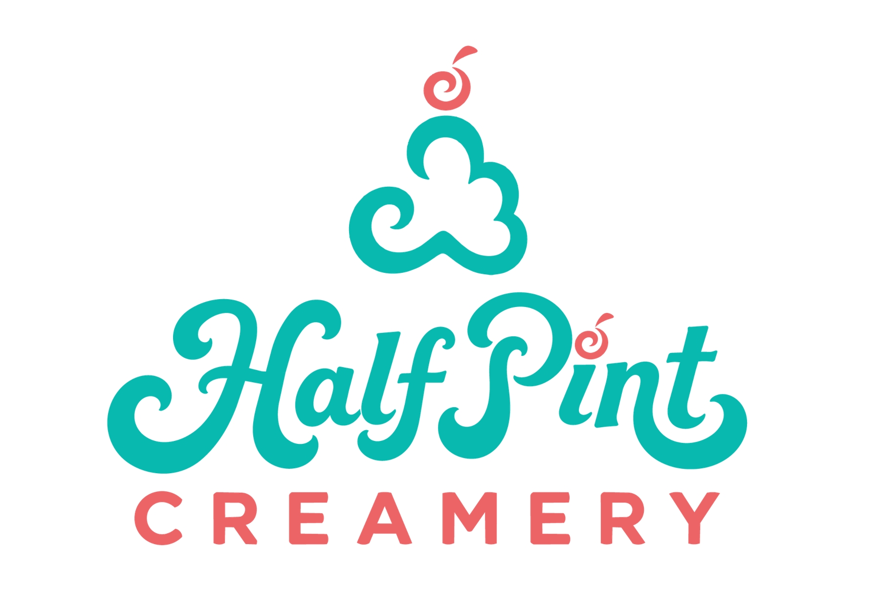
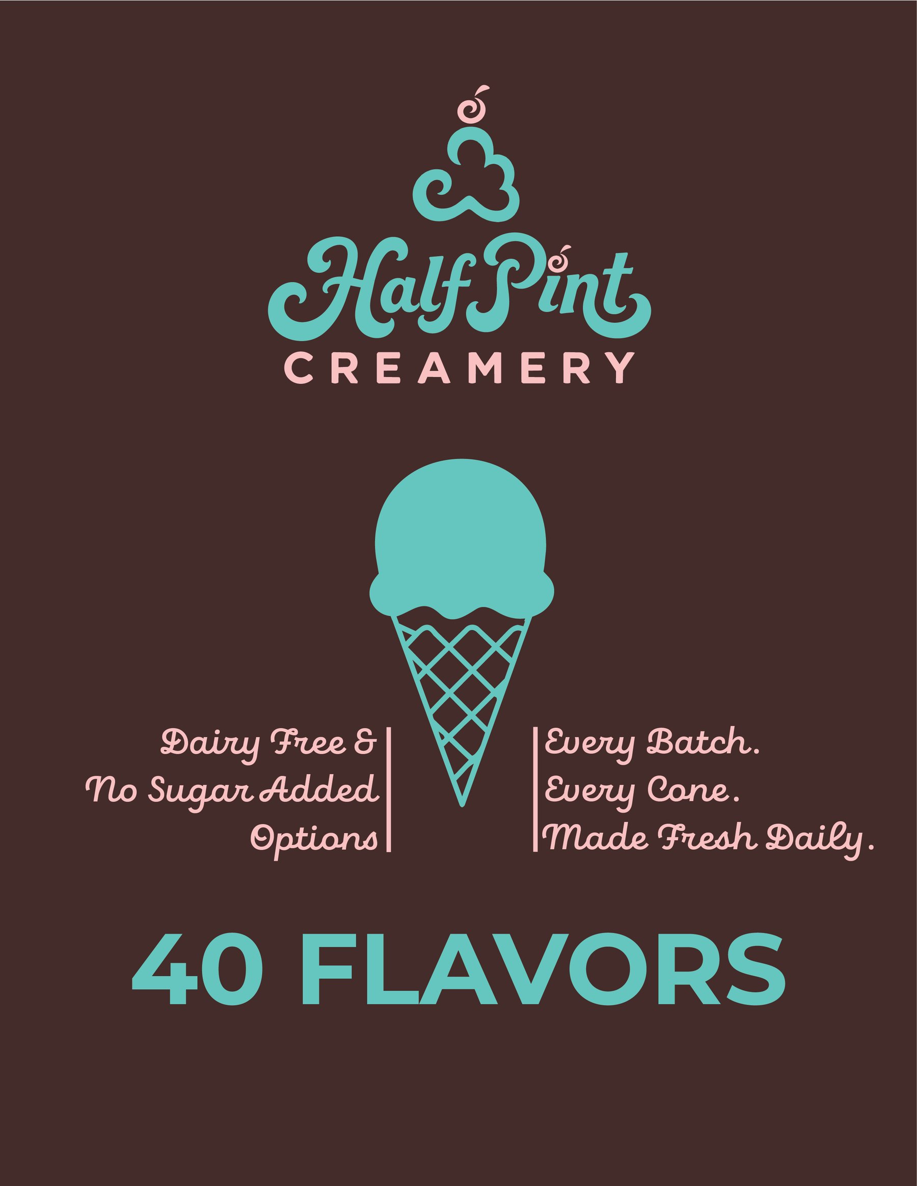
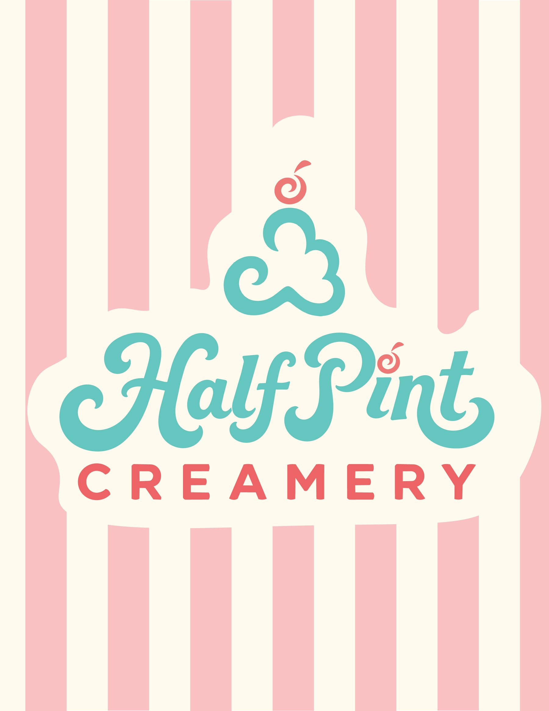
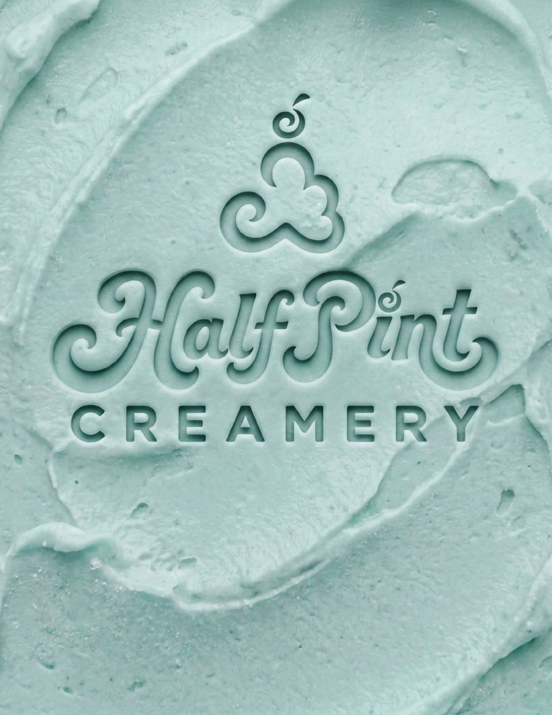
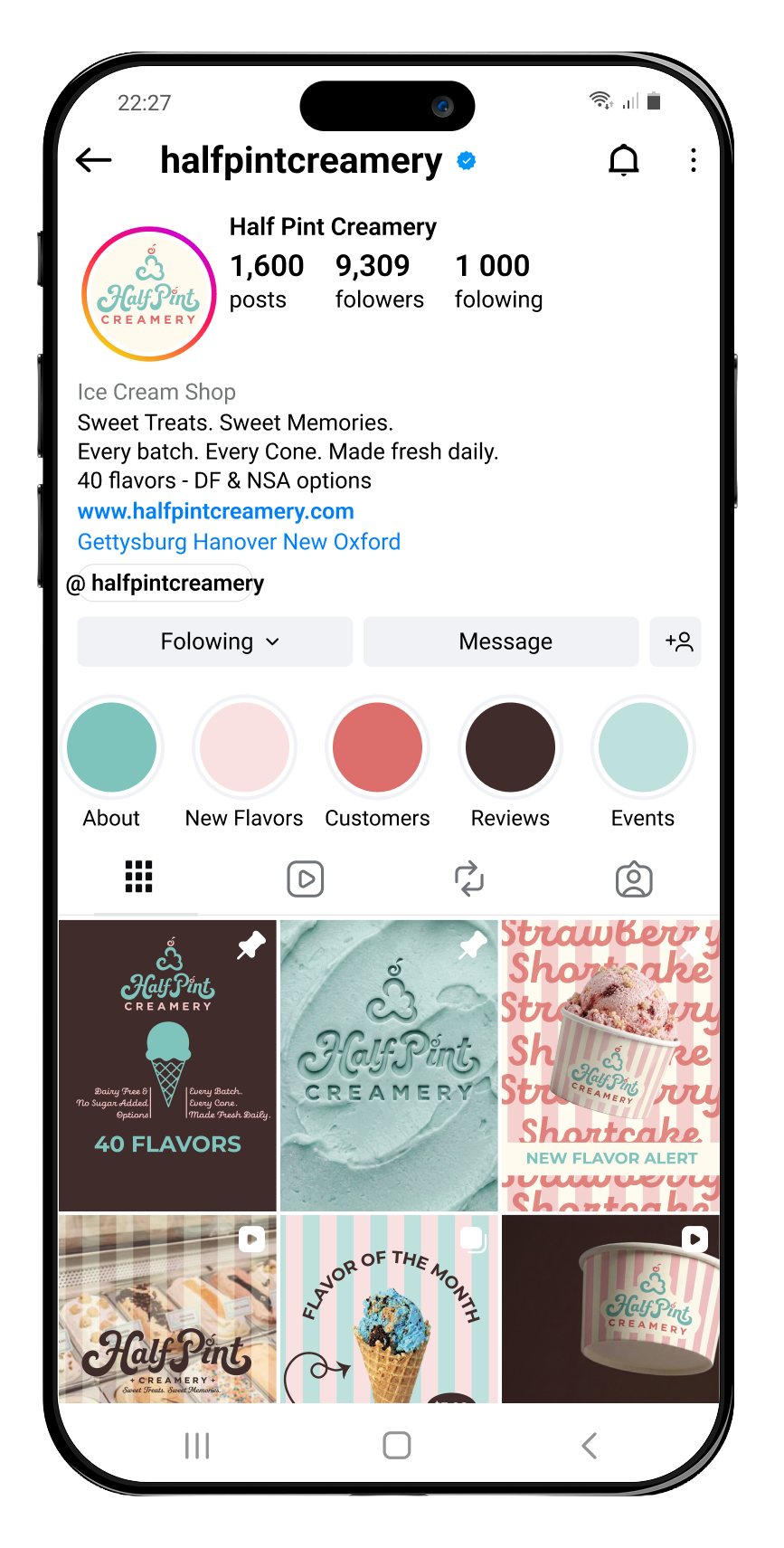
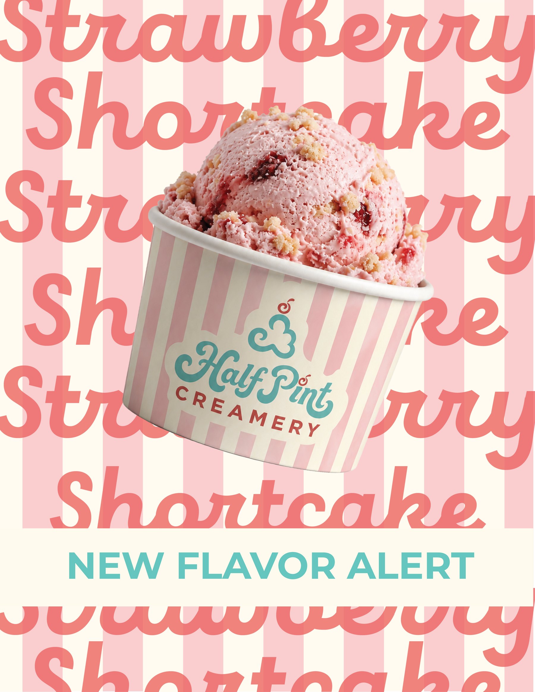
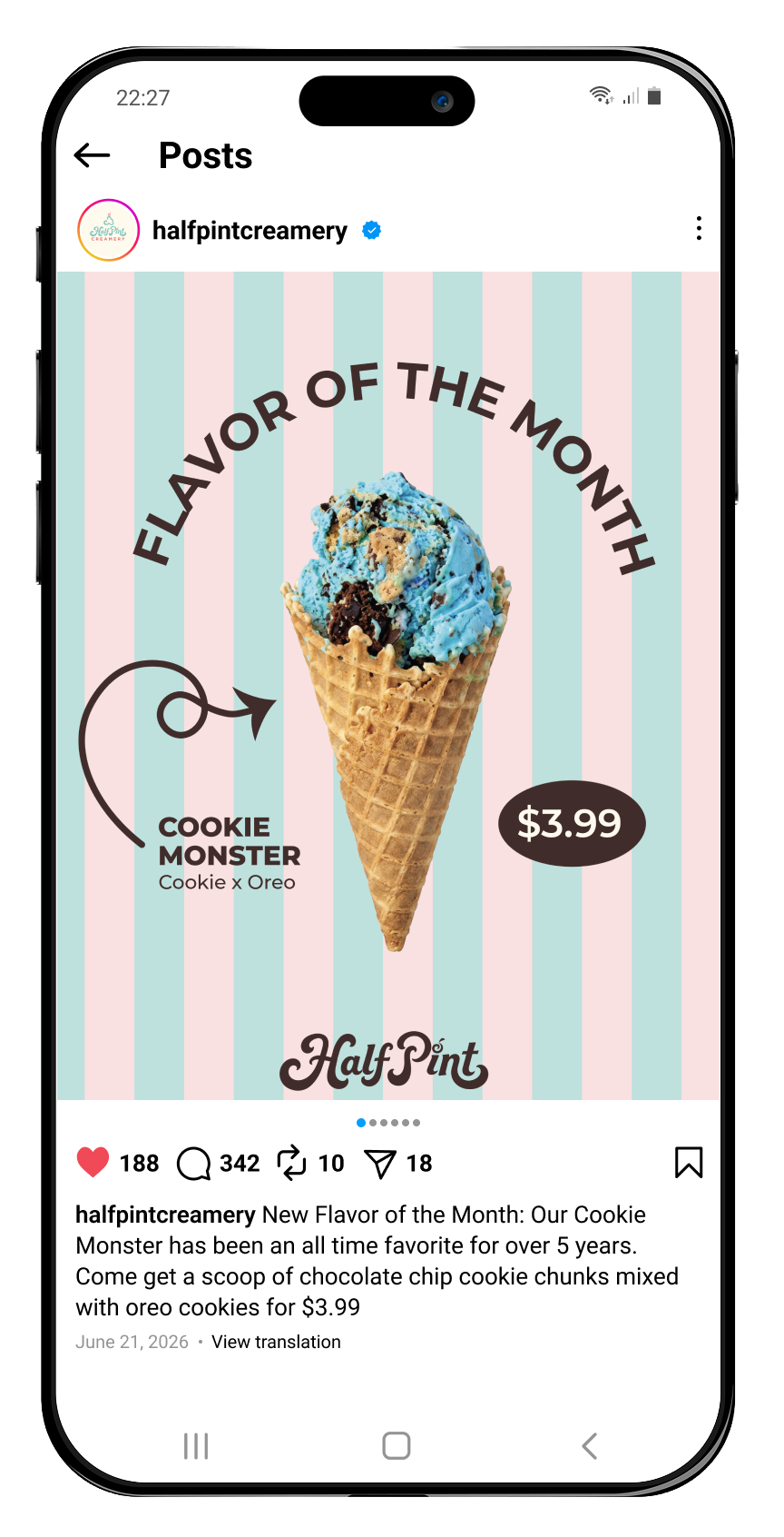
A flexible logo suite pairs expressive lettering with a pink, mint, and cream palette. Supporting patterns and graphic elements create continuity across packaging, storefront signage, and social media. For the separate paid Super Secret Scoop Society campaign, mission-inspired ticket designs frame each monthly mystery pint as an invitation into a secret ice cream mission.
Deliverables
- Concept logo suite & visual identity
- Packaging & signage concepts
- Social media brand applications
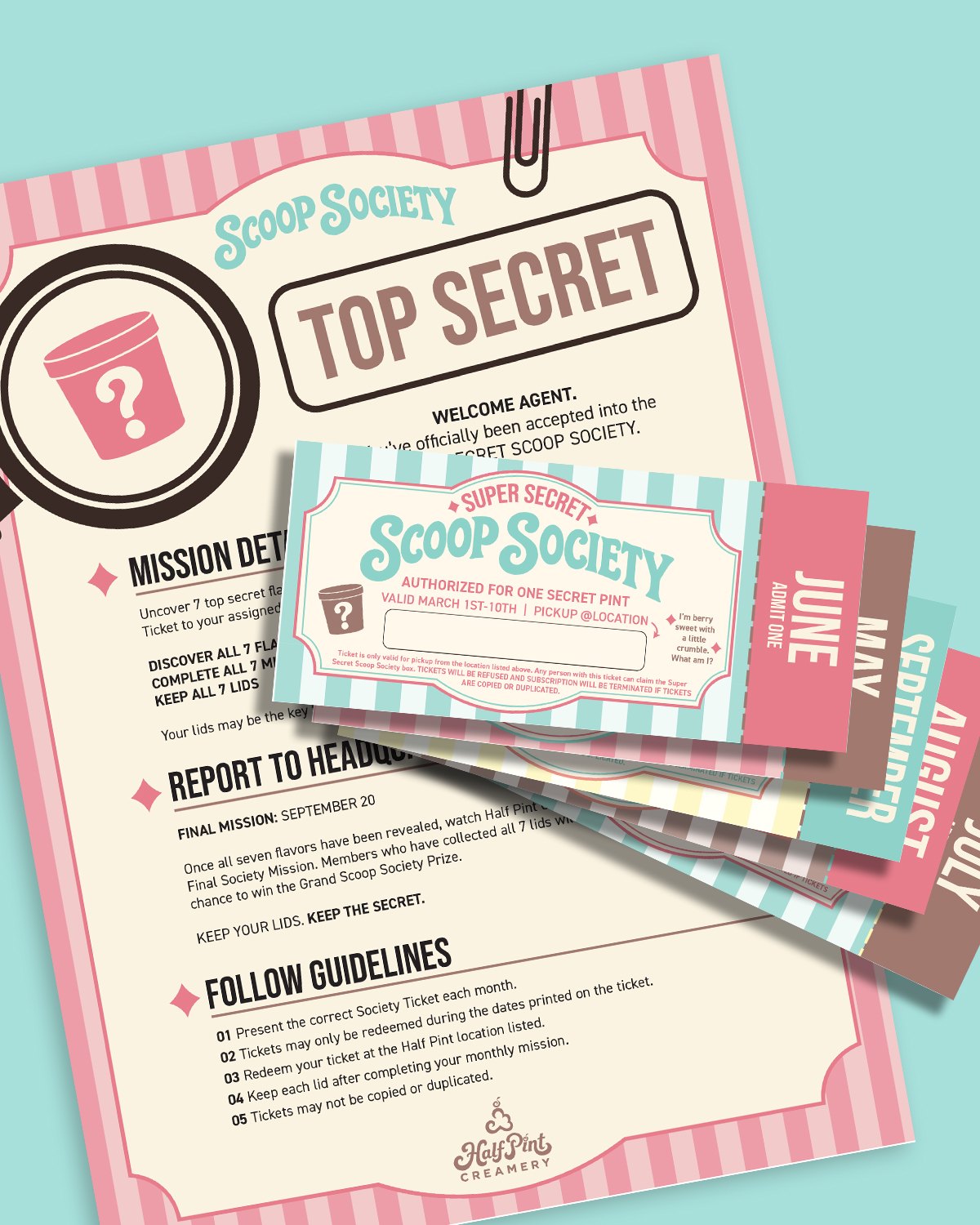
- Monthly ticket designs (paid client work)
Where it started
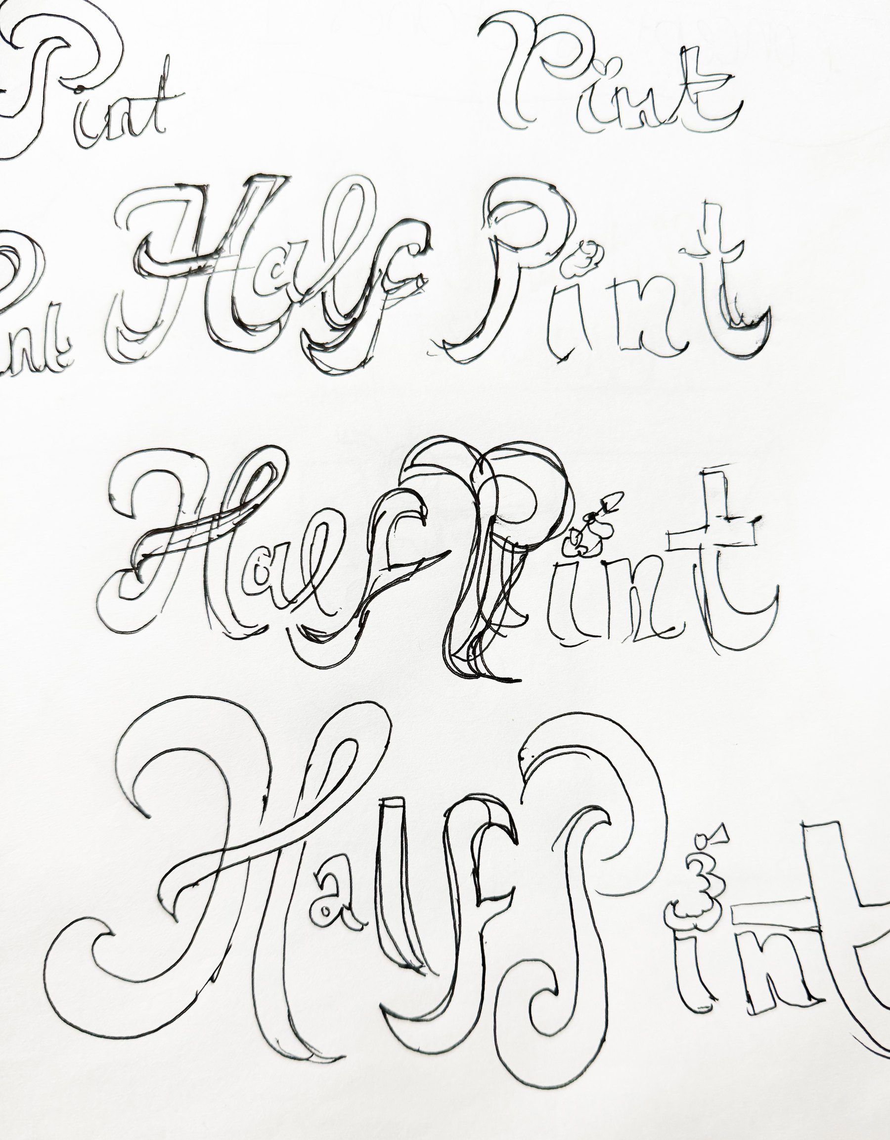
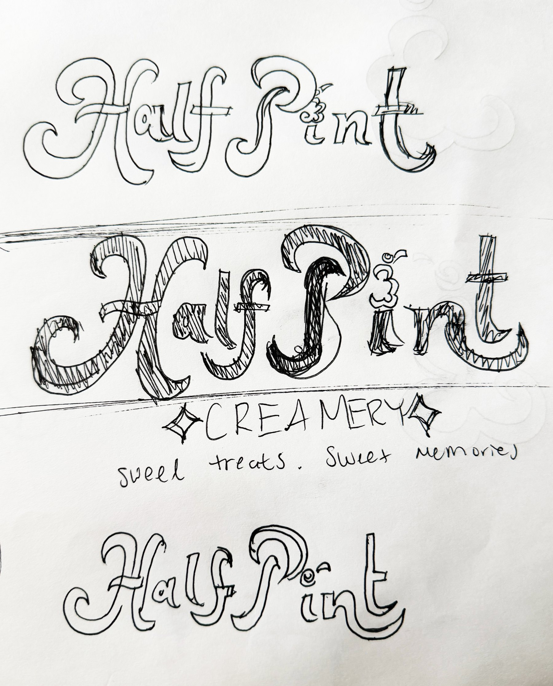
Sketches & roughs
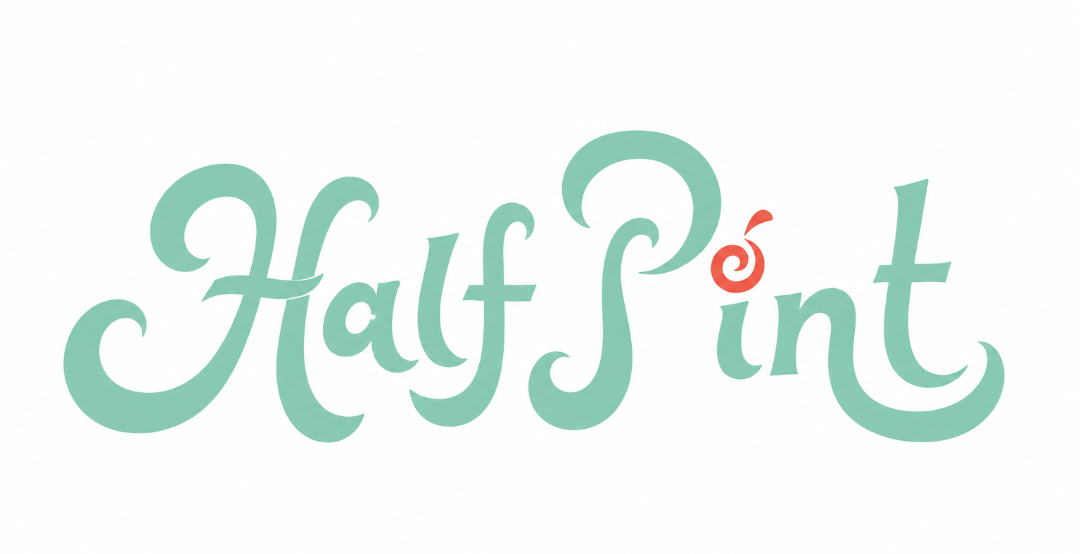
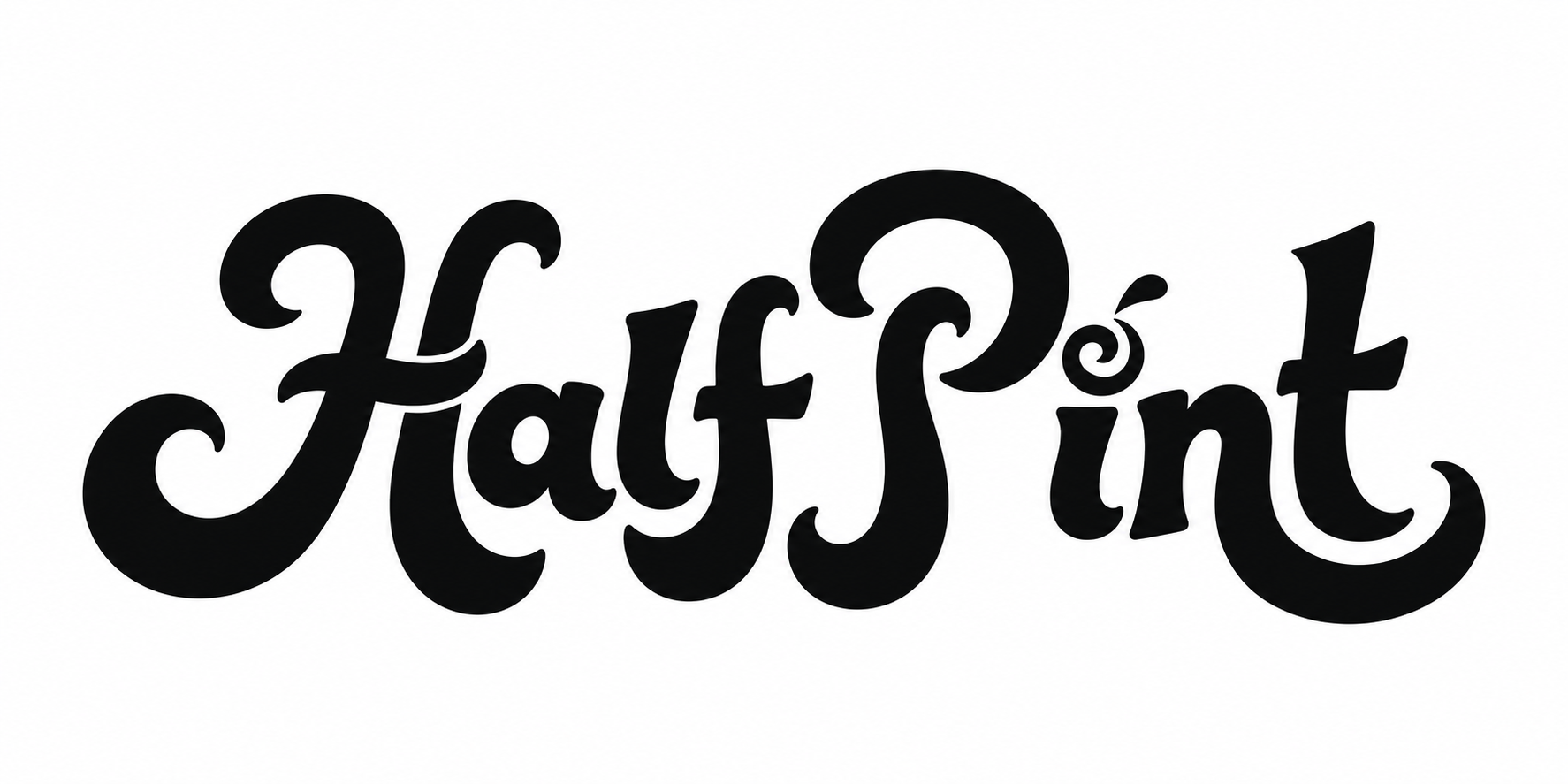
Final logos
Brand applications
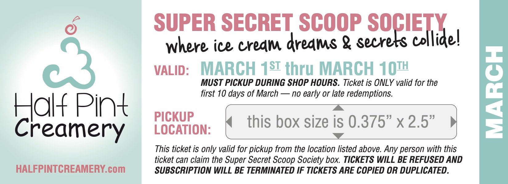
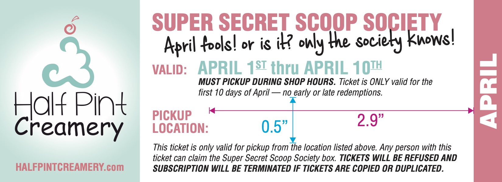
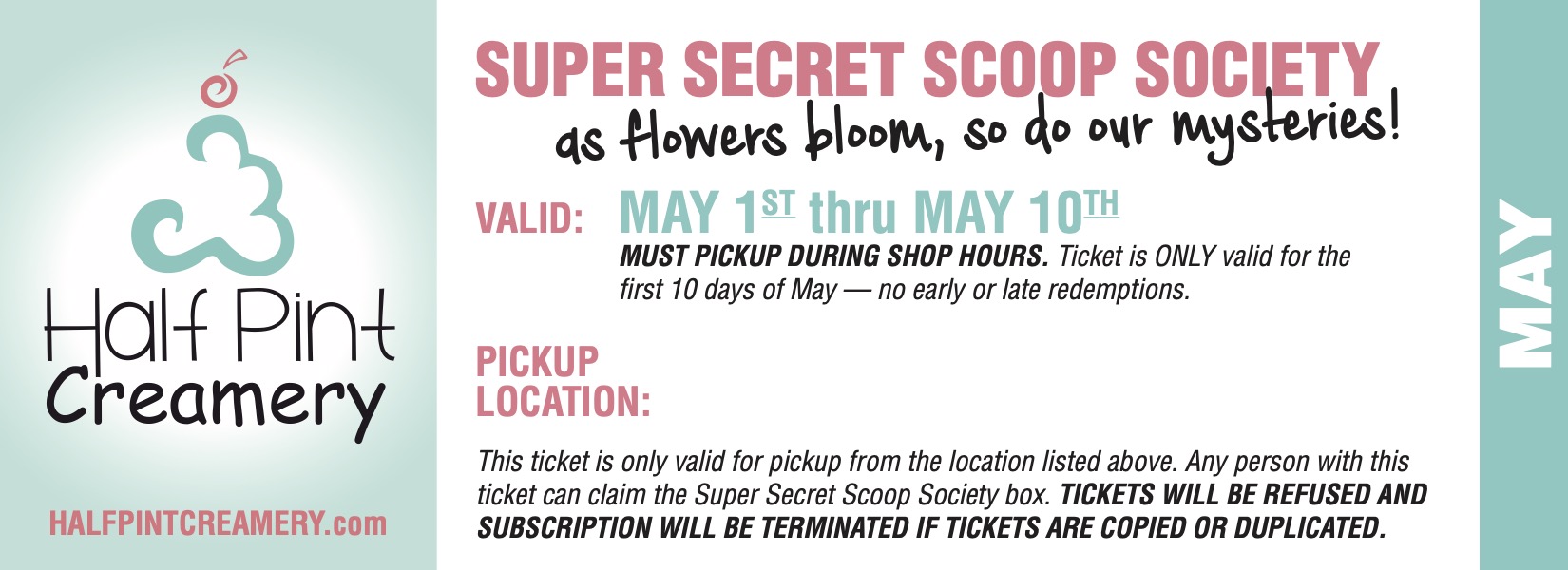
Super Secret Scoop Society
A paid ticket-design commission for a monthly mystery pint of ice cream, March through September. The creative direction draws on classified mail and mission invitations, making each ticket feel like acceptance into a secret ice cream mission.
Next project
Reverie Wines →
Want something like this for your business?