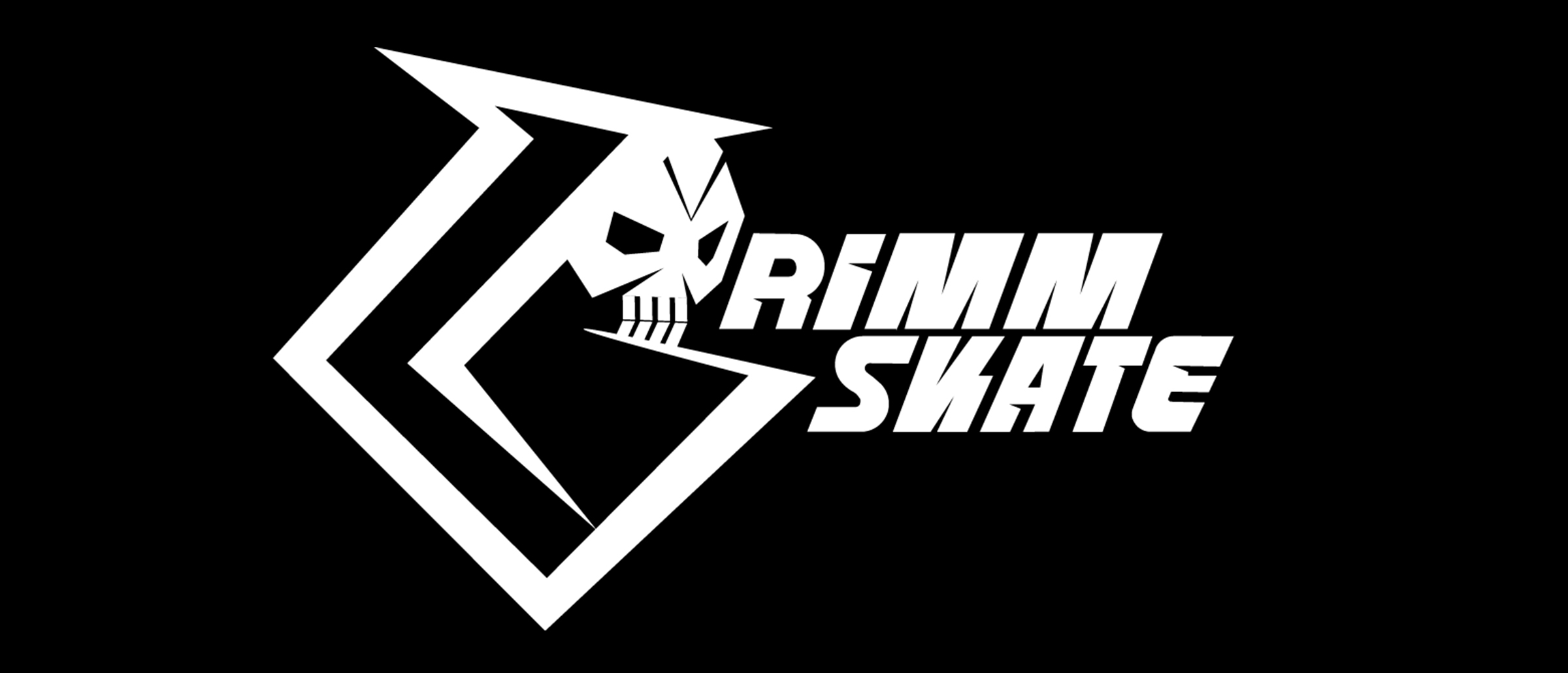
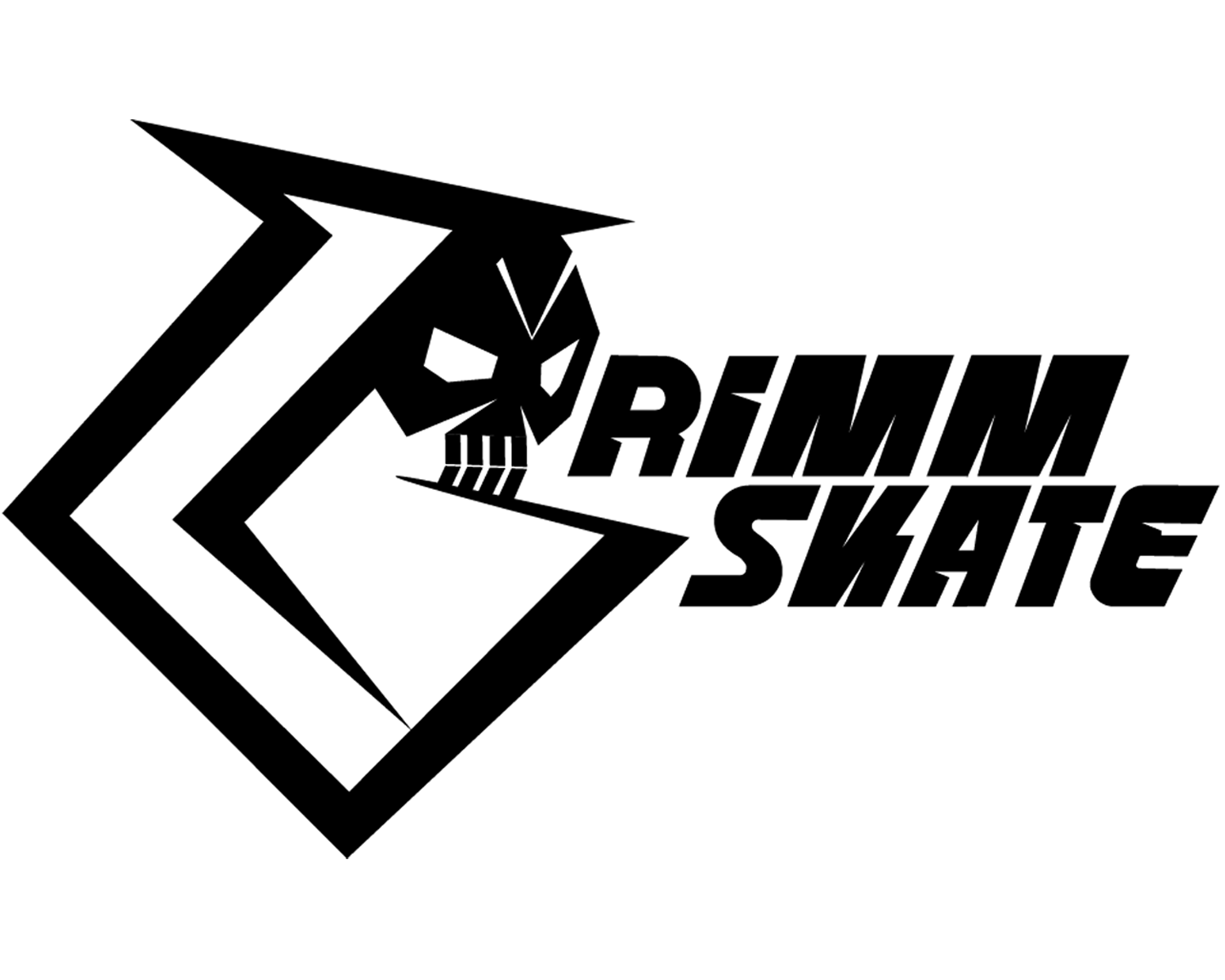
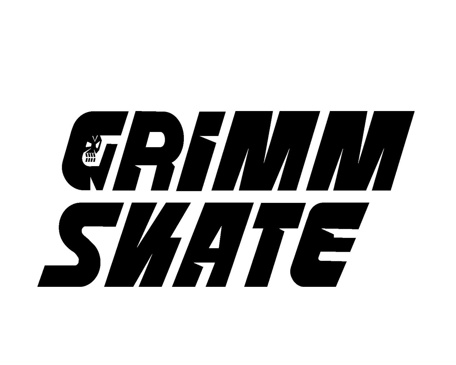
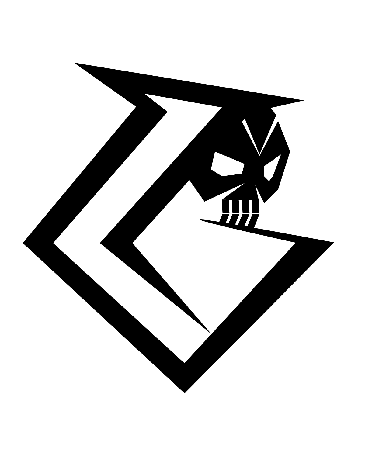
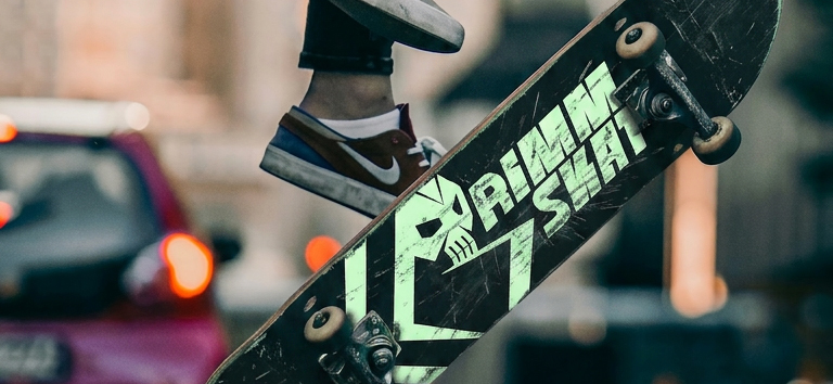
Grimm Skate is built around bold visuals and a strong identity. A reaper and "G" concept with custom lettering creates something that feels gritty but still angled and controlled — a brand that stands out on decks, apparel, and social without losing consistency.
Academic project, created during design studies.
The challenge
Building a skate brand identity with attitude — a logo system and merch line that feel dark and gritty without becoming unreadable or sloppy.
The solution
A reaper skull tucked into an angular "G" mark with aggressive custom lettering, kept disciplined by a black-and-white palette with a mint accent so every piece — deck, tee, poster, post — reads as one brand.
Deliverables
- Primary logo, secondary lockup & submark
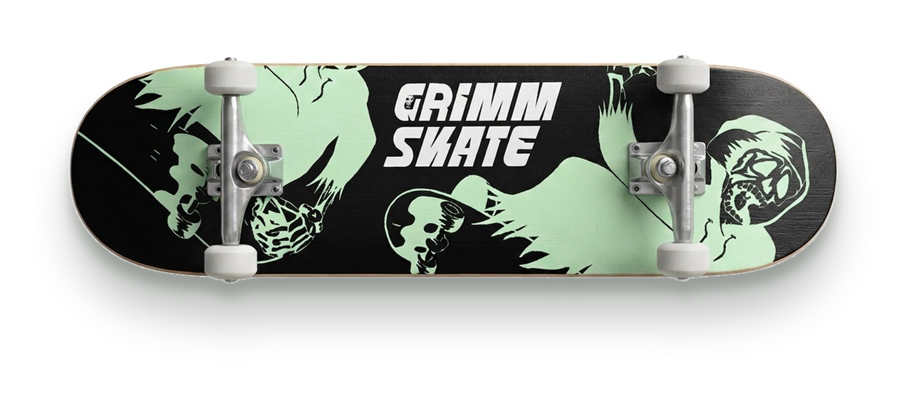
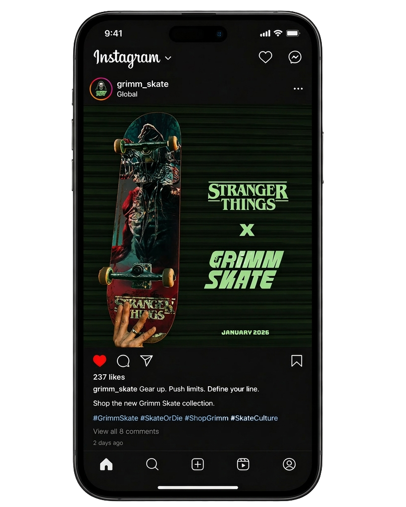
- Skateboard deck graphics
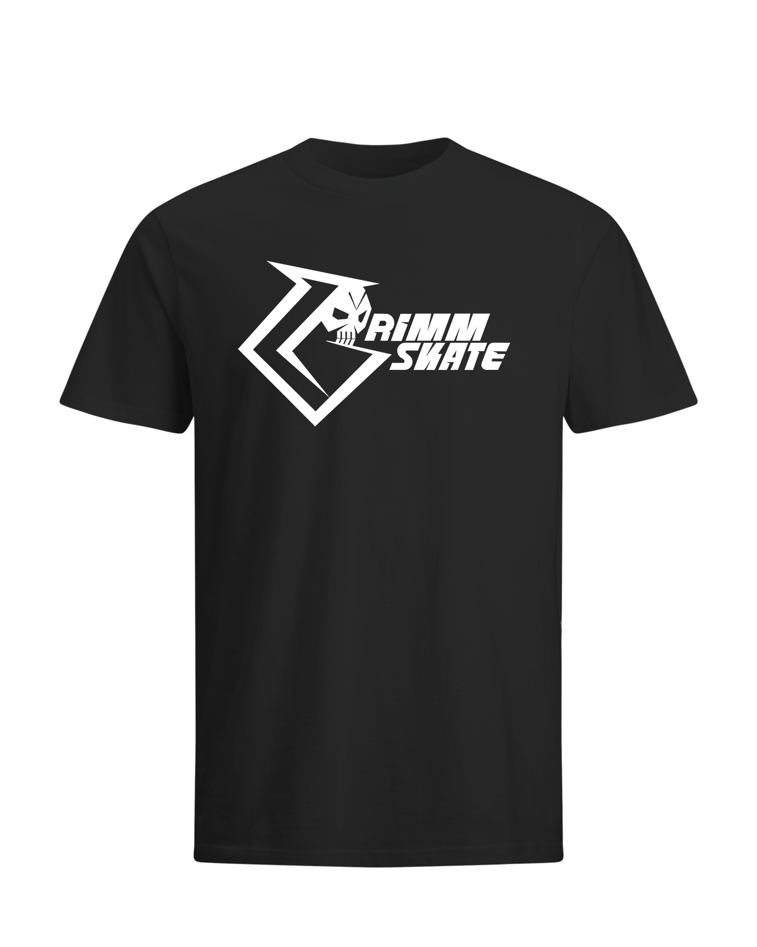
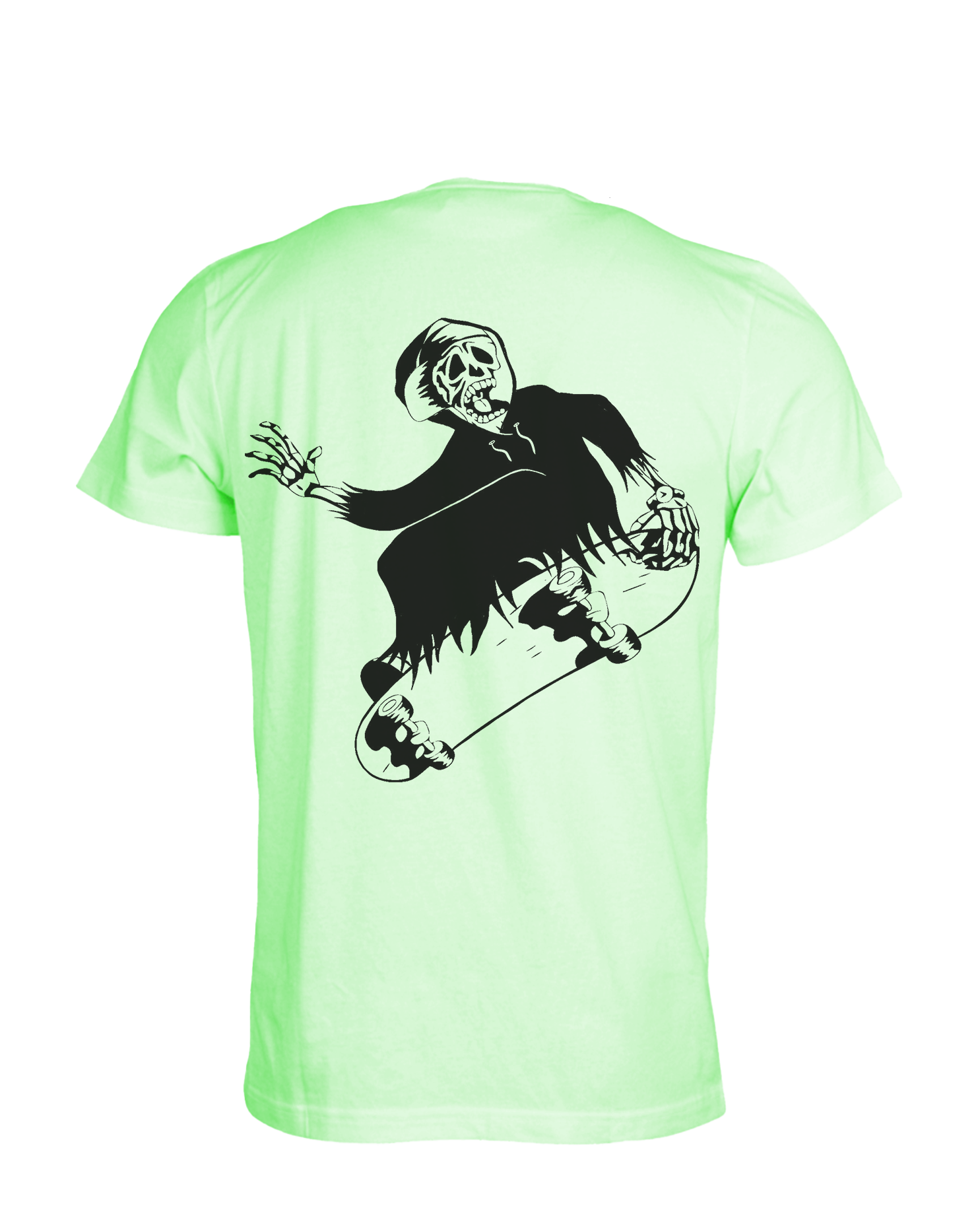
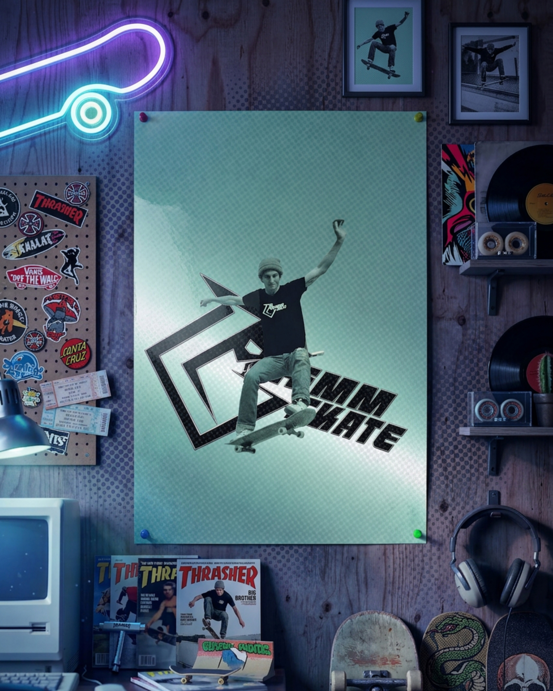
- Poster & t-shirt designs
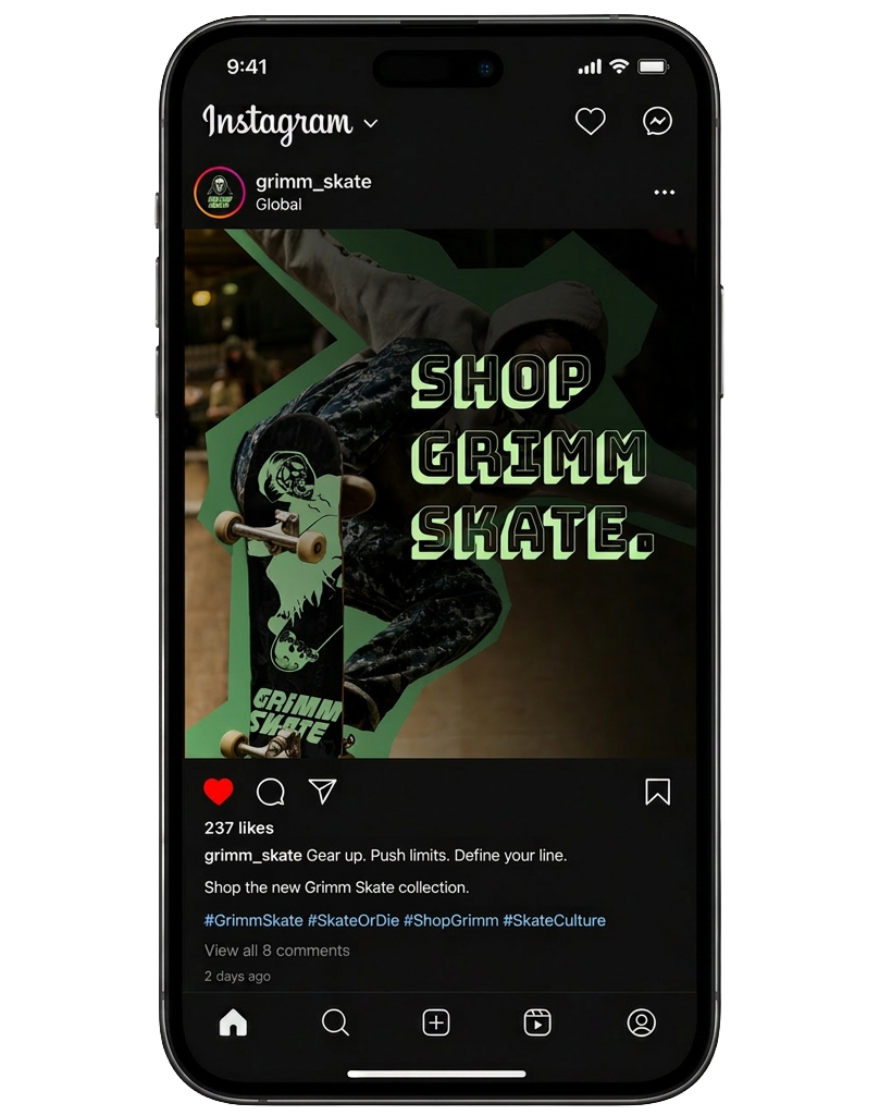
- Social media posts
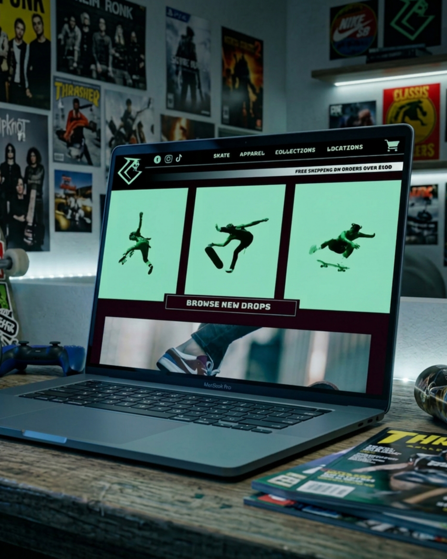
- Website design
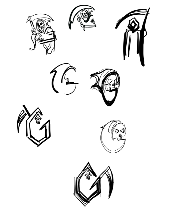
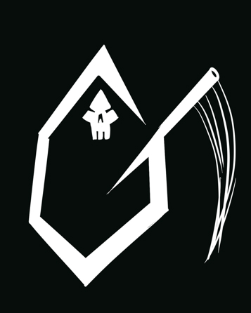
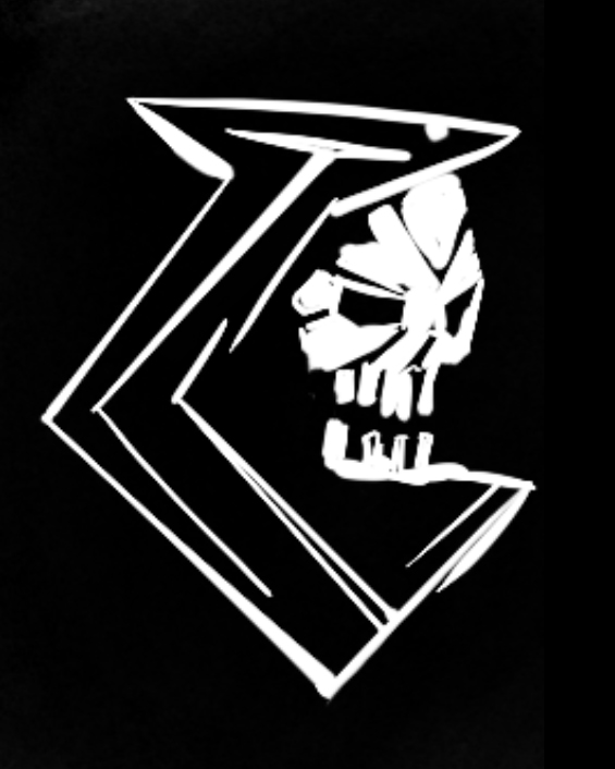
Sketches
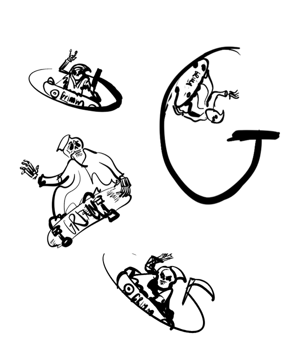
Roughs & concepts

Final logos
In the world
Next project
Midtown JuiceLab →
Want something like this for your business?